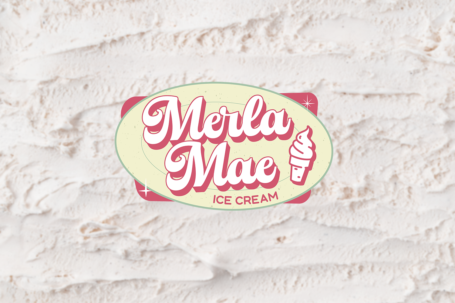
Merla Mae Logo © 2024 Anelise Marques
This project focused on developing a cohesive and nostalgic rebranding for Merla Mae, a traditional ice cream shop. The objective was to create branding that would be consistently applied across multiple assets, including a corporate kit, menu design, food truck branding, and hand-drawn illustrations, all while staying true to the brand’s retro and cheerful personality.
The logo design features bold, retro-inspired typography paired with playful elements that evoke the joy and nostalgia of enjoying ice cream on a sunny day. The logo is versatile and easily adaptable for a variety of applications, from packaging to signage, ensuring consistency across all touchpoints.

Merla Mae Corporate Kit © 2024 Anelise Marques
The Merla Mae corporate kit was designed to extend the brand’s retro charm and nostalgic personality across all business materials while maintaining consistency and professionalism. The kit incorporated the brand’s signature colour palette—Raspberry, Waffle Cone, and Pistachio—creating a warm, inviting aesthetic inspired by classic ice cream flavours.
The design carried through various elements, including business cards, letterhead, envelopes, and branded stationery. Business cards featured the logo prominently with a clean yet playful layout, while the letterhead and envelopes maintained a structured format with subtle brand accents.
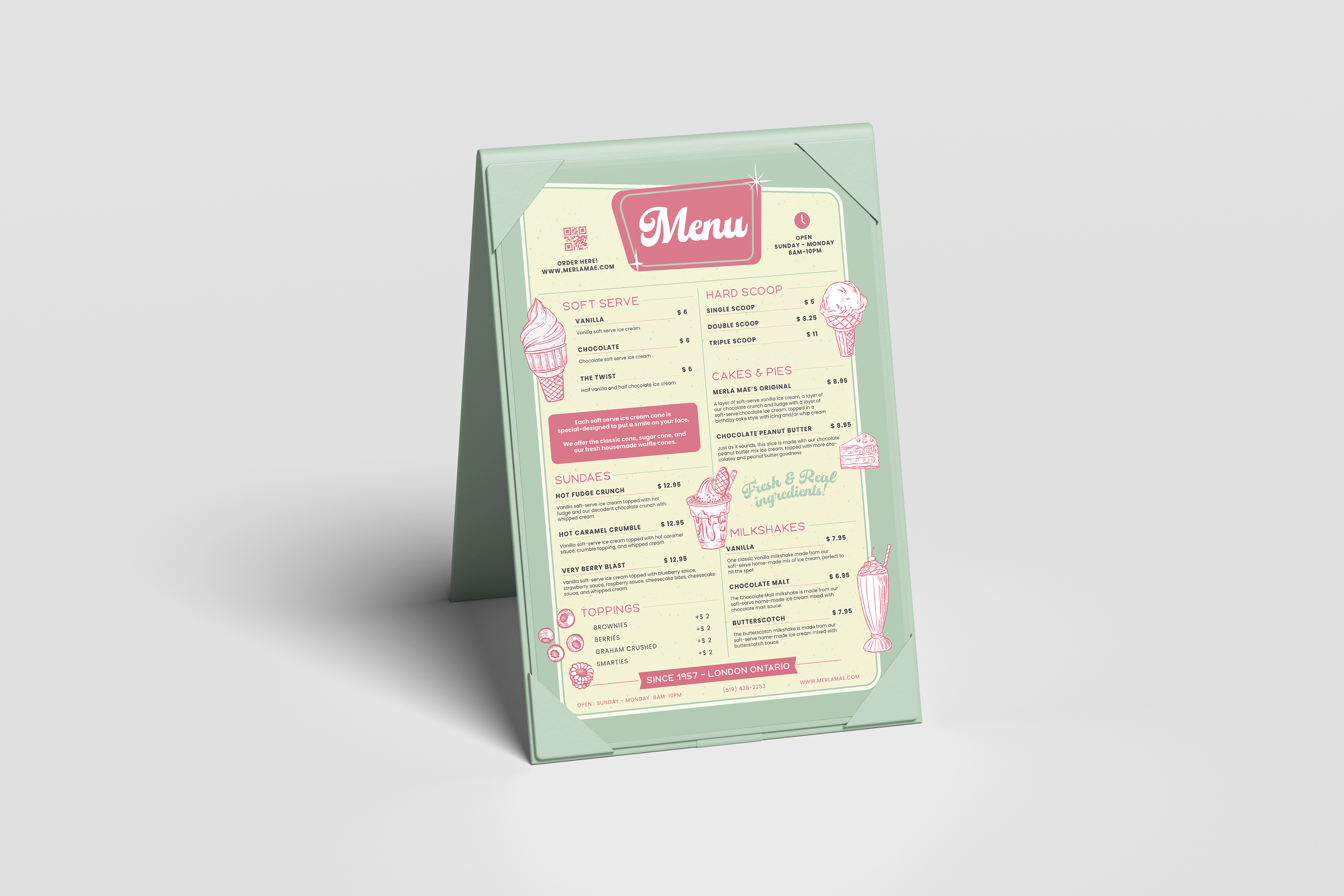
Merla Mae Menu © 2024 Anelise Marques
The menu design incorporated the brand colours to highlight key sections, making the layout visually engaging and easy to navigate. A clean yet playful typeface combination was used, balancing modern readability with a vintage-inspired aesthetic. The multi-column grid layout ensured the information was well organized, providing clarity while maintaining a lively design.
A standout feature of the project was the use of hand-drawn illustrations, which added a whimsical and personal touch to the brand. These illustrations—depicting ice cream cones, scoops, and other elements—enhanced the retro charm and reinforced the brand’s approachable and fun personality. The textured and organic feel of the illustrations made them a perfect fit for the nostalgic yet fresh identity of Merla Mae.
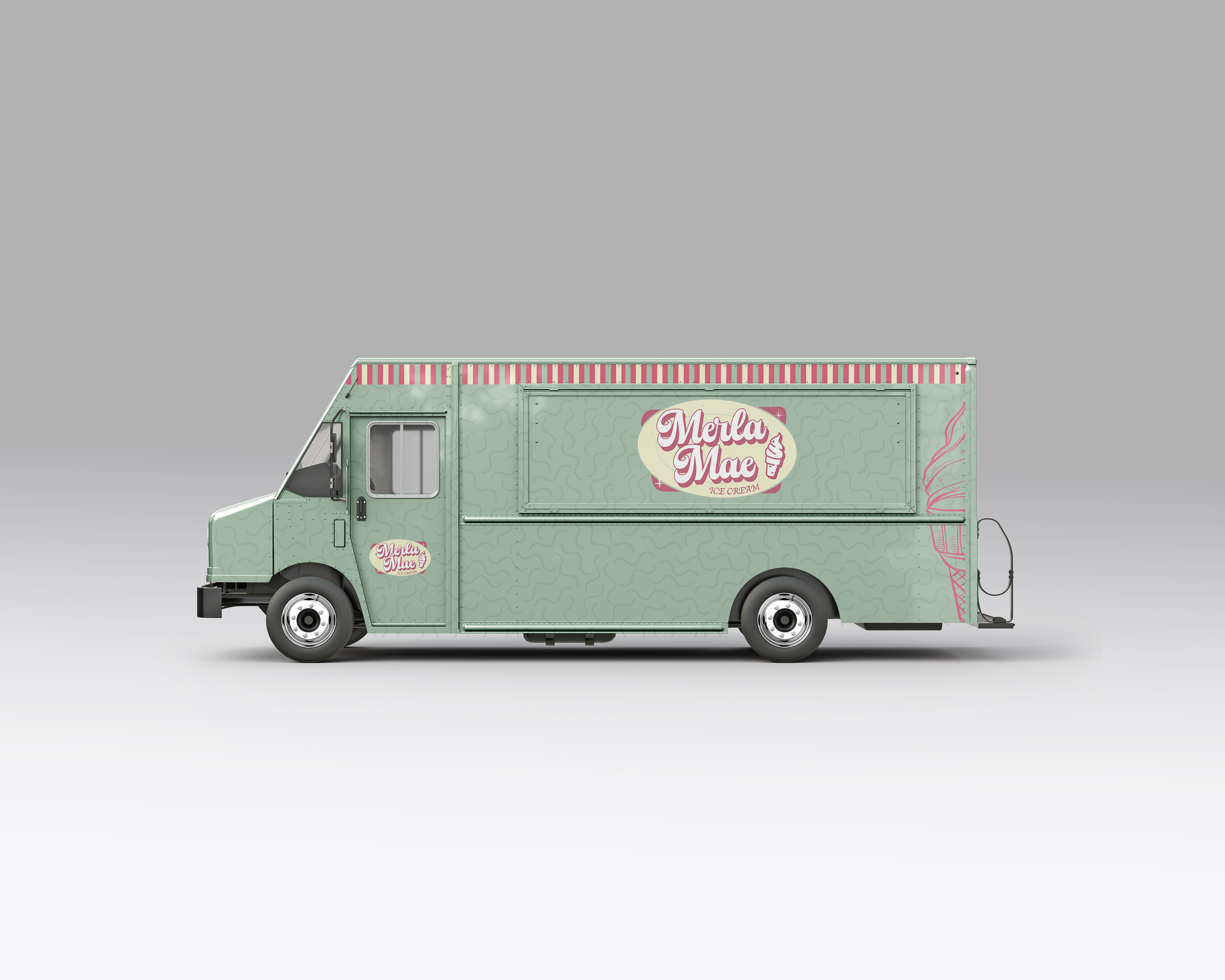
Merla Mae Food Truck Design © 2024 Anelise Marques
Additionally, the food truck branding extended the style guide's principles to create a mobile experience that felt seamless with the shop’s visual identity. The food truck design featured the vibrant palette, bold typography, and playful illustrations, transforming the vehicle into a lively, branded space that could draw attention and delight customers on the go.
This project highlights the power of consistent branding across various applications, from stationery to food trucks, while incorporating unique design elements like hand-drawn illustrations. The result is a cohesive, engaging, and memorable brand identity that perfectly captures the spirit of Merla Mae.